Vail Resorts / iOS Mobile App Design
Vailable App. Link to prototype: https://invis.io/UJDCJFXTD
Scope
Vail Resorts was founded as Vail Associates LTD by Pete Seibert and Earl Eaton in the 1960s. They opened Vail Mountain in 1962. Since 2010, Vail Resorts has seen astronomical growth. They bought ten resorts in the last seven years and now own fifteen mountains.
Vail is a huge powerhouse in the mountain resort industry, however, they lack an efficient and informative way to communicate their multiple mountain locations and lodging offerings to users. My team and I had the opportunity to create a personalized experience by combining learning about travel destinations and planning a trip.
Research
Our research was driven by the original problem statement, “how might we help users narrow down their mountain resort search?” We conducted three separate research methods that led us to our designs: competitive/comparative analysis, google forms survey, and user interviews.
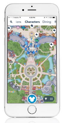
We ran competitive research using the brands Disney and Expedia due to the fact that they were both travel apps. Something we took note of from the Disney mobile app was that they had a top scrolling bar which you don’t see very often. This was something they had definitely done well; this top navigation scrolling bar allows for the user to easily access a set of options within one screen. As for Expedia’s mobile app, we enjoyed the way that they displayed their content in a card style form. We incorporated both of these discoveries into our app design.
We ran comparative research using David’s Bridal App and the REI Co-op App. We appreciated the way that David’s Bridal generates specific dress preference results to individuals based on a quiz-style set of questions. As for the REI Co-op app, we liked their aesthetically pleasing display of National Park listings and the way that they advertised precipitation data. We incorporated these into our final designs as well.
Our next method of research consisted of a Google Forms Survey with a set of questions based on individuals planning preferences. We received 50 responses. We learned that location, outdoor activities, and flights were the most important details when planning a trip. 44% of user surveys said that they “sometimes” like planning trips; many said that they don’t like planning trips when they are too complicated. Several users noted that planning apps / websites can either be helpful or frustrating. We needed to gather some more data to verify these findings, so it was time to conduct user interviews.
We conducted six user interviews with a set of questions that dealt with individuals trip planning processes and their preferences. We learned that users don’t like to sort through a ton of options, they prefer to plan in advance, they typically use google to search locations and weather, and they don’t enjoy doing research themselves.
Disney App.

Expedia App.

David's Bridal App and REI Co-op App.
Synthesis and Personas
All of our research methods were helpful when trying get closer to finding the real problem for our client. We synthesized all of this data using affinity mapping and found some compelling insights:
“I need help thinking of activities to do.”
“I have resources to go to for flights.”
“I don’t like when there are too many steps / pages when planning.”
“I don’t like when resources I use aren’t credible.”
“Package deals help me save time and money.”

Primary Persona.

Secondary Persona.
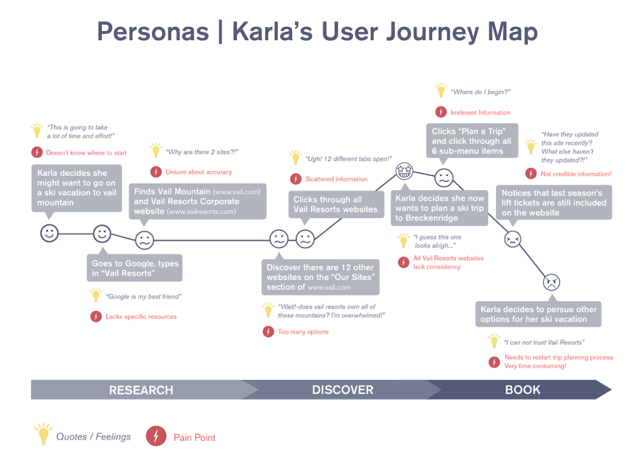
Using our primary persona, Karla, we laid out the typical path that she would take when trying to book a trip to a mountain owned by Vail Resorts.Karla begins her trip planning process using Google. She finds two links that lead her to two different Vail Resorts websites. She clicks on one of the links and within that site, she finds fifteen separate links for each mountain. She is already overwhelmed by this process. Vail Resorts loses a customer.
We needed to address this journey and eliminate the struggle points with our new mobile app. Our research, personas, and user journey map allowed to uncover the real problem.
Translating Research into Design
Before entering into the design phase of our process, we looked back at our research findings to help for some ideas for the priorities that would go into our iOS app. The features that we decided would be most beneficial included an additional activities option when generating trip packages, a discovery feature included in the tab bar for learning about different mountains, making the entire booking process step-by-step to insure clarity for the user experience, and keeping information consolidated.
We were also able to uncover the real problem. Vail Resorts has many different mountain locations, offerings, and activities. This can be overwhelming to individuals who want to learn about the best location that is available to them and their interests. “How might we help users discover vacation opportunities while simplifying the planning process within a single application?”
Design
Eventually it was time to hold a team design studio. This is where we were able to brainstorm designs based on our research thus far, and sketch it down on paper. We then discussed our individual ideas and were able to form one powerful conclusion. We were ready to begin wireframing.
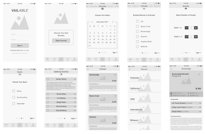
After lots of low-medium fidelity wireframes and iterations, we were ready to construct high-fidelity mockups. With that, we synced the mockups into InVision and built a prototype.
Testing
Before conducting usability tests, we listed a set of goals that we wanted to see being accompished:
Users should be able to purchase a package that suits their needs
The checkout process should be easy to understand
Users should be able to discover information about Vail Resorts Mountains
6/6 users successfully purchased a package and 6/6 users were able to discover information about Breckenridge Mountain. Although, 3 our of 6 users tapped “Book Now” when asked to learn about Breckenridge Mountain and 6/6 users chose the range of dates rather than the individual dates.
Iterations
After receiving feedback and gathering insights from usability testing, we revised and improved some of the functions of our app.
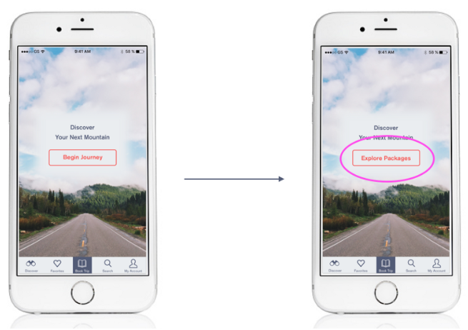
Users struggled with words begin journey so we changed the call to action button to say explore packages. This made the task more direct and improved clarity.

When clicking select all, it is more reassuring to the user when all items are check automatically.
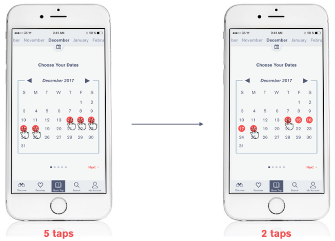
We observed that users would only tap the first and last days that we asked them to go on a trip within the task. Originally, we had the user tap every single day in between as well — this did not work well for the user so we made it available to the user to only have to tap the first and last days they were going away.
Next Steps
Looking forward, our next steps will include:
Designing a path for the user to book a trip to the mountain within the respective discovery screen
Working with a development team to make all aspects of our prototype interactive
Pitching this iOS Mobile App idea to Vail Resorts