DEV, a community of developers
Dev.to is an online community where programmers learn, share ideas, and find opportunities. The founders of this start-up began their journey with a popular Twitter account called, @ThePracticalDev.
Our objective was to create an online community for sharing and discovering great ideas, having constructive debates, and making friends.
The founders at dev.to wanted our help, as experience designers, to improve the onboarding and sign up process, as well as encourage their users to comment on posts and write their own articles. They were also interested in improving usability throughout the site, such as publishing a post using their editor software, discovering and following tags and users, reacting to articles and comments, and responding to notifications.
Research

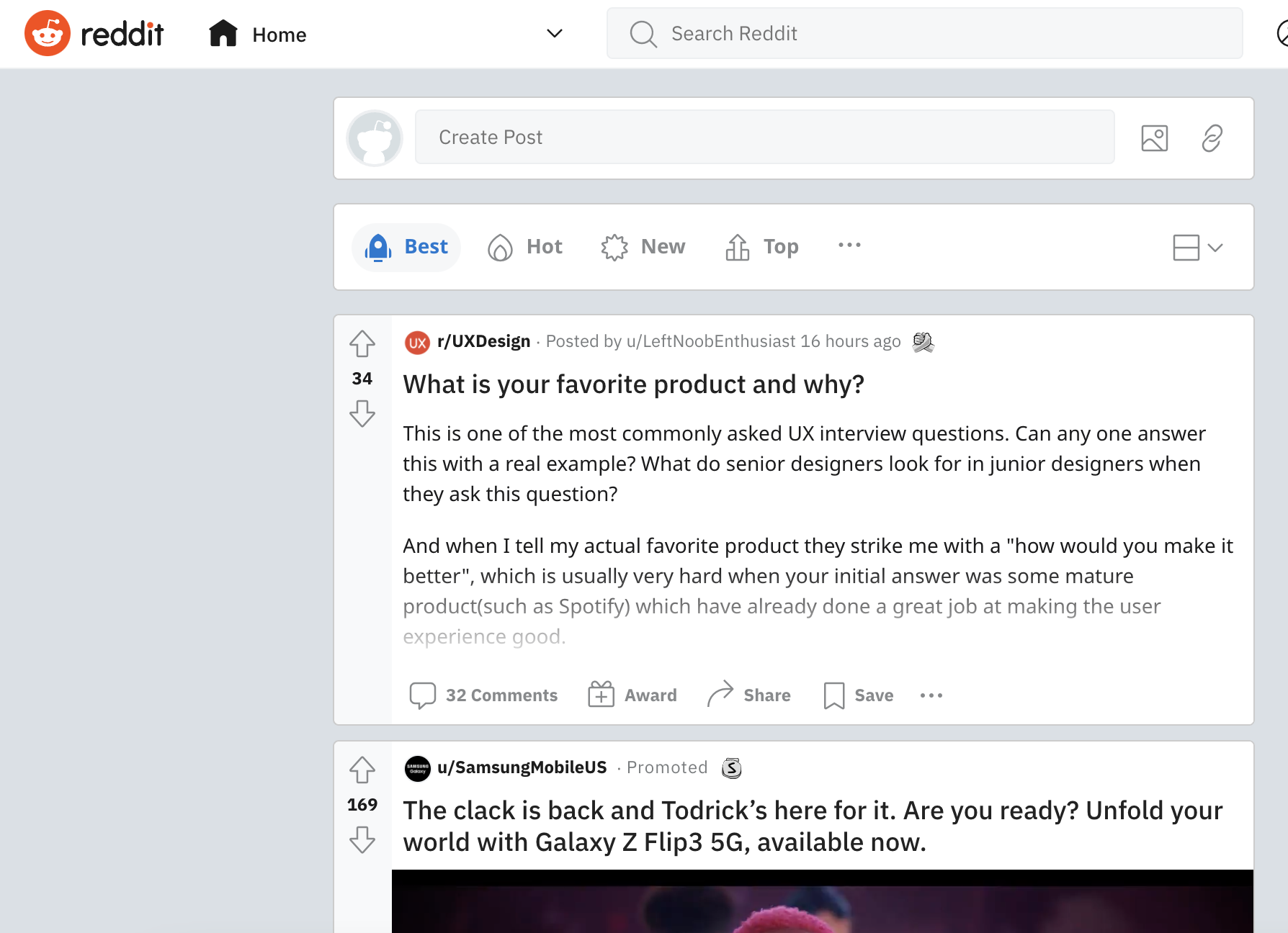
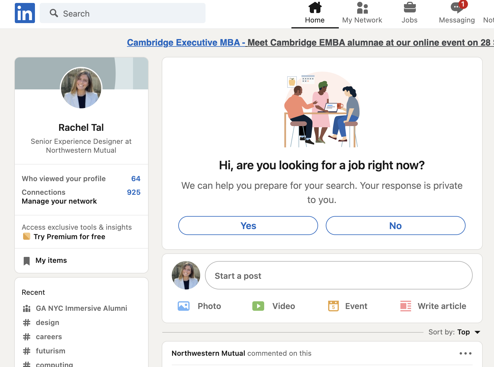
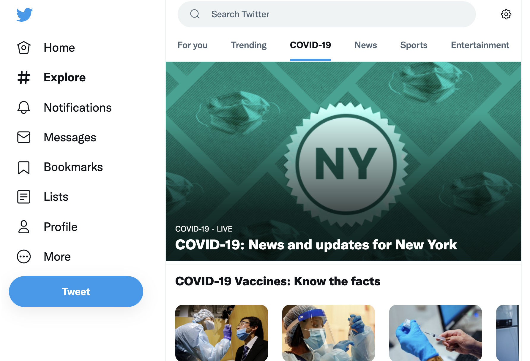
Stack Overflow organizes specific research results using tags and categorization. LinkedIn separates each of their posts with a break to prevent great deals of content from looking too condensed. Twitter’s navigation allows for specified search results. Reddit has a wide variety of content, not only developer specific. Various topics up front for a brand new user.
We ran user interviews in order to gain insight on community participation and engagement, as well as receive general feedback on dev.to. We discovered that a lot of users were accessing the site via Twitter. They were hesitant to create content, and wanted the most relevant content when entering the homepage.
We conducted usability tests to help us understand more about the current dev.to website. We put together a series of scenarios and tasks for users to perform that would help us to learn about the pain points on the site.
Users were unaware of podcast content,
Could not tell the difference between a discussion and an article,
Did not like being brought to a separate page to check their notifications,
Unable to distinguish between search results,
Did not appreciate the infinite scrolling,
Felt the homepage was overwhelming.

Synthesis + Persona
Synthesizing helped us to identify common themes about the type of experience our users were searching for on the platform.
The need for education in the onboarding process,
A clean and simple user interface that is easy to navigate,
Immediate and relevant content upon entry and sign up,
Ability to consume content without having to create content,
Access to constructive feedback on personal work.


Sketching


High Fidelity Wires + Prototype


User Testing Results
Using our prototype, we ran several usability tests using a series of scenarios and tasks. We wanted users to understand what dev.to was all about upon sign up, what the tags are used for, how to access their profile and dashboard, how to filter and easily access search results, and be able to differentiate between comments and replies.
5/5 users successfully created an account and understood the website through the on boarding process.
5/5 users understood the initial tag feature.
4/5 users successfully went to their dashboard to check their articles.
5/5 users successfully edited their profile and
5/5 users successfully searched for articles through tags.
Although, 5/5 users thought the arrow on the comment box meant “expanding” and 3/5 users could not differentiate between notification title and the actual notifications.